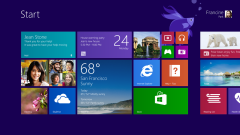
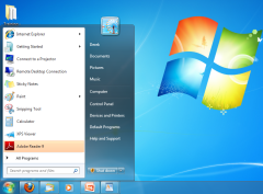
Microsoft knows that Windows 8 has been very polarizing to much of its user base but it feels that it had no choice but to try to implement some kind of touch-centric OS in a world where smartphones and tablets are eating into PC sales. Neowin has spotted some comments made by Microsoft UX designer Jacob Miller, who recently took to Reddit to explain why Microsoft made a lot of the design choices it did with Windows 8, including the original decision to make the Metro UI the default boot-up screen. What emerges is a portrait of a company trying its best to please two different audiences by trying to make two completely different operating systems and stapling them together.
Miller writes that Microsoft wanted to make the Metro UI mostly for more casual computer users who were flocking to iOS and Android devices because they offered simple and intuitive platforms for basic computing tasks. For power users, Microsoft kept the more familiar desktop mode that gave them access to more of the features they were accustomed to enjoying.
“Metro is a content consumption space,” he explains. “It is designed for casual users who only want to check facebook, view some photos, and maybe post a selfie to instagram. It’s designed for your computer illiterate little sister, for grandpas who don’t know how to use that computer dofangle thingy, and for mom who just wants to look up apple pie recipes. It’s simple, clear, and does one thing (and only one thing) relatively easily. That is what Metro is. It is the antithesis of a power user.”
Miller goes on to explain that the Metro UI is actually a good thing for power users, however, because it will let Microsoft add a lot more features for them in the desktop mode while keeping the Metro screen separate for all of the computer illiterates out there.
“Before Windows 8 and Metro came along, power users and casual users – the content creators and the content consumers – had to share the same space,” he says. “It was like a rented tuxedo coat — something that somewhat fit a wide variety of people. It wasn’t tailored, because any aggressive tailoring would make it fit one person great, but would have others pulling at the buttons.”
All of this sounds nice except Microsoft seems to have simultaneously annoyed both sets of users for different reasons: Power users don’t want to have to deal with Metro UI and more casua... on the desktop mode. Miller acknowledges that there’s been a lot of dissatisfaction with many of the changes that Microsoft made with Windows 8 but he says that the company is listening very hard to user feedback and will incorporate it into Windows 9 when it releases next year. In fact, Miller explicitly says that Windows 9 will be to Windows 8 what Windows 7 was to Vista.
“Windows 7 couldn’t have existed without the lessons we learned from the mess that was vista,” he writes. “Xp couldn’t have existed without 2000. Hopefully Windows 9 will be a solid refinement on all this.”


