TBD on Ning
CW 09 Border Radius
Before I started playing with the template again, I changed the body background and put the body top margin and wrapper code back to the original settings. background.
body
{ margin-top: 50px;
margin-bottom: 20px;
padding: 0px;
background: #ffffffurl(images/IMAGE_NAME_AND_SUFFIX) repeat left top;
font-family: 'Open Sans', sans-serif;
font-size: 10pt;
color: #6F644C;}
#wrapper
{ position: relative;
margin-bottom: 50px;}
Then I started playing with the border-radius which is found in 3 places in the Flourish template defaut.css file.
Original Code before changes
/** CONTENT */
#content
{ position: absolute;
right: 10px;
width: 725px;
padding: 10px 10px 40px 10px;
background: #FFDA99;
box-shadow: inset 0px 0px 0px 10px rgba(255, 255, 255,0.50);
border-radius: 40px 0px 40px 0px;
}
.box
{ overflow: hidden;
padding: 40px 40px;
background: #B01E73;
box-shadow: inset 0px 0px 0px 10px rgba(255, 255, 255,0.90);
border-radius: 0px 40px 0px 40px;}
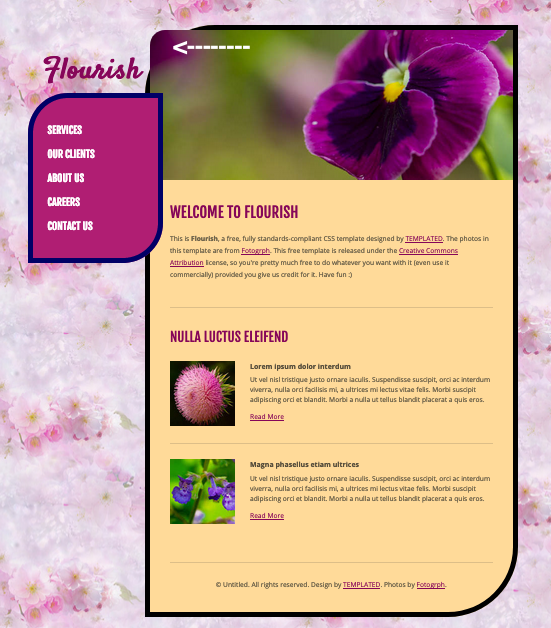
Example of changed code with screenshots:
/** CONTENT */
#content
{ position: absolute;
right: 10px;
width: 725px;
padding: 10px 10px 40px 10px;
background: #FFDA99;
box-shadow: inset 0px 0px 0px 10px #000000;
border-radius: 140px 0px 140px 0px;}
.box
{ overflow: hidden;
padding: 40px 40px;
background: #B01E73;
box-shadow: inset 0px 0px 0px 10px #000066;
border-radius: 80px 0px 80px 0px;}
I changed the color of the border in the #content (big box) to black - #000000 - and the color in the class .box (sidebar) to navy blue - #000066
I changed the size of the curve in the 2 border corners in the #content code from 40px to 140px - border-radius: 140px 0px 140px 0px;
I changed the size of the curve in the 2 border corners in the .box for 40px to 80px and also changed the order of the border-radius code so that different corners are curved - border-radius: 80px 0px 80px 0px;
Notice the "header image sticks out on the left. That is because the image is controlled by this code:
.image-style img
{ border-radius: 30px 0px 0px 0px;}
I made the first radius bigger to fit better inside the box. Here's the screenshot:
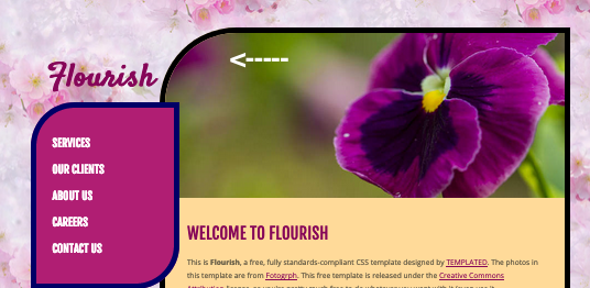
And here is the change made in the code:
.image-style img
{ border-radius: 130px 0px 0px 0px;}
I made some changes to the border colors and to the background in the main container to get the template more to my liking. Here's the screenshot.
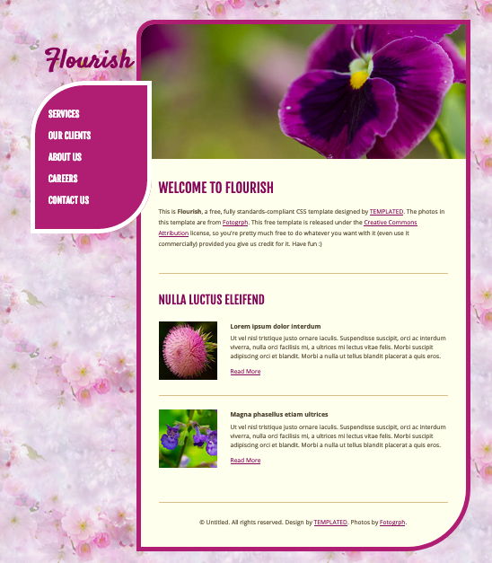
And here's what I did:
I changed the class .image-style img back to what it was:
.image-style img
{ border-radius: 30px 0px 0px 0px;
}
I changed the background color of the id #content, the color of the border and have 2 different border radius amounts on opposite coners:
#content
{ position: absolute;
right: 10px;
width: 725px;
padding: 10px 10px 40px 10px;
background: #FFFFEE;
box-shadow: inset 0px 0px 0px 10px #b01e73;
border-radius: 40px 0px 140px 0px;}
And I changed the border color on the class .box and enlarged the border-radius numbers on two corners making the box resemble a petal - that is, it resembles a petal if you have a really active imagination!
.box
{ overflow: hidden;
padding: 40px 40px;
background: #B01E73;
box-shadow: inset 0px 0px 0px 10px #FFFFFF;
border-radius: 120px0px 120px 0px;
}
Have fun playing around with the border raius size and order of the code and with the color of the backgrounds and borders. We'd love to see the results and the code you used, so share as much as you would like to share.
Views: 6
© 2025 Created by Aggie.
Powered by