TBD on Ning
CW 08 Full Page Background
A full page background can be impressive, but it can also be frustrating. Big images take up bandwidth which can be a problem. And now it is even harder to decide on a size for the image because of the wide range of screen sizes of the different devices used to travel the internet.
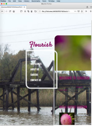
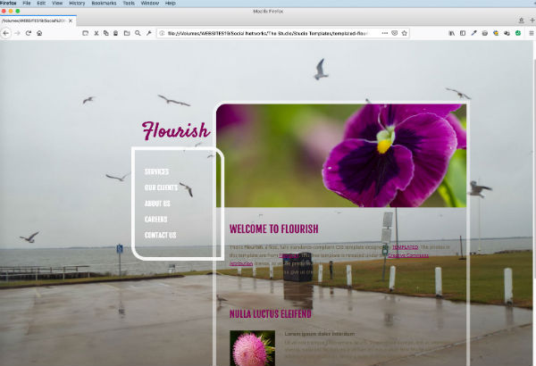
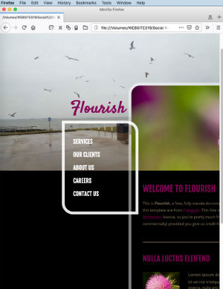
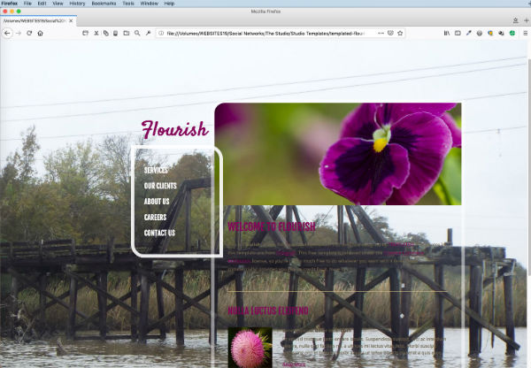
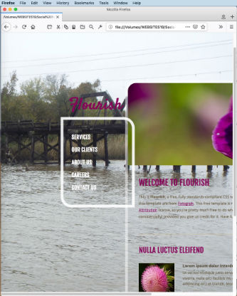
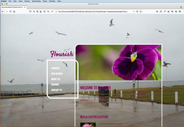
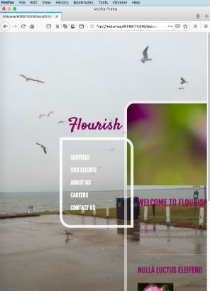
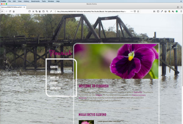
The examples in this thread use 2 images. The "bay" image is 1440 x 900 and the "bridge" image is 1440x1620.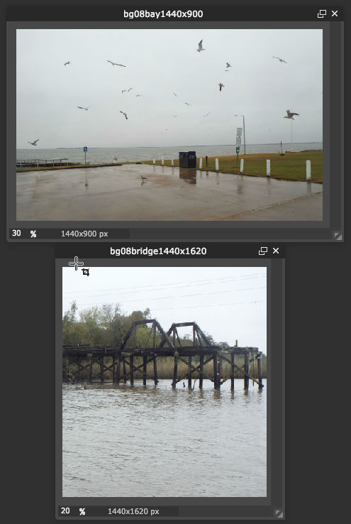
Later, you can choose an image of your own to place in the "Flourish" images folder. Replace IMAGENAME.jpg in the body background code in the "default.css"file with the name and suffix (jpg or png) of the image you put into the folder.
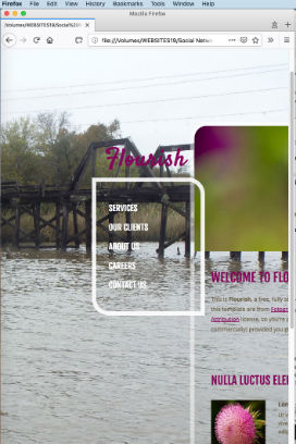
Example 1
In the past, people would size their image to fit the average computer screen. This wasn't ideal because the whole image doesn't show if the screen is smaller than the image. If the screen is bigger than the image, the background color shows. Here's an example of code that was used.
background: #000000 url(images/IMAGENAME.jpg) top center no-repeat fixed;
Here are some screenshots showing each image with a wide window and a small window.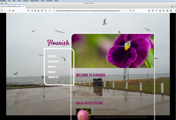
Example 2
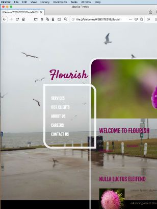
Later on, someone came up with the idea of using relative sizes to make a fluid background and used code similar to this after the color and image
background: #000000 url(images/IMAGENAME.jpg) top center/ 100% auto no-repeat fixed;
The image would change width to fit the screen, but it kept the ratio. So many times the background color would show at the bottom - especially if the original image was wider than it was tall. If the image was taller than the screen, you wouldn't see the whole image. Here are some screenshots showing each image with a wide window and a small window.
Example 1
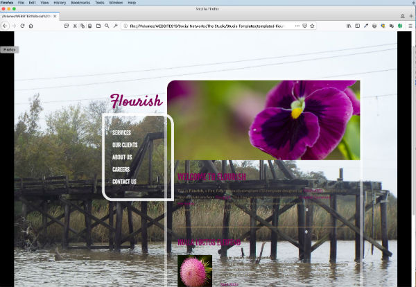
More recently, browsers started recognizing some of the newer CSS includingg "cover"
background: #000000 url(images/IMAGENAME.jpg) center center/cover no-repeat fixed;
Here are some screenshots showing each image with a wide window and a small window.
So, have some fun with some images. You might find some you'd like to play with at https://www.pexels.com/, https://morguefile.com/ or https://unsplash.com/. Put the image in the Flourish image folder. Change the body background code in the "default.css" file to the one you want to play.with. Replace IMAGENAME.jpg in the code with the name and suffix (jpg or png) of the image you put into the folder and see how it looks. Test out all the codes and see which one you like best.
----------------------
NOTE: I've also changed the template "default.css" background in the "content" section and the "box" section just so the background shows up a little better. You can scroll down the file until you find these sections and change the background color to the word, "transparent" if you want or change the background of those sections to the color or image you want there.
#content
{
position: absolute;
right: 10px;
width: 725px;
padding: 10px 10px 40px 10px;
background: transparent;
box-shadow: inset 0px 0px 0px 10px rgba(255, 255, 255,0.50);
border-radius: 40px 0px 40px 0px;
}
.box
{
overflow: hidden;
padding: 40px 40px;
background: transparent;
box-shadow: inset 0px 0px 0px 10px rgba(255, 255, 255,0.90);
border-radius: 0px 40px 0px 40px;
}
------------
For more information about background code, you might be interested in these articles:
"The Best Full Screen Background Image Sizes for Web Design" https://www.webmalama.com/the-best-full-screen-background-image-siz...
"CSS Background Shorthand Property" https://www.webfx.com/blog/web-design/background-css-shorthand/
Views: 9
© 2025 Created by Aggie.
Powered by